Reflection
Designing the Lily Pulitzer iOS app highlighted the importance of translating an existing web experience into a mobile-first product while staying consistent with the brand’s design system. The process required adapting layouts, navigation patterns, and interactions so the experience felt natural on smaller screens.
Working closely with engineers also introduced the nuances of building interfaces with SwiftUI, ensuring the UI followed Apple’s Human Interface Guidelines while maintaining Lily Pulitzer’s visual identity.
This collaboration helped bridge design decisions with technical implementation and ensured the mobile experience aligned with native iOS interaction patterns.
Primary Research

Julian (34 years)
Recently relocated professional
“I moved here for work, but I want a life outside work too where people talk about things beyond AI. In this busy city, plans get cancelled so often.”

Araav (22 years)
New graduate studentl
“I don’t know anyone here yet. I just wish I had a small circle to explore the city with me on a budget.”

Stella (30 years)
Recently relocated residentl
“I’m excited to meet new people, but I’d feel more comfortable if I had a smaller, close-knit group to begin with.”
Secondary Research
The online patterns validated the problem
Competitive Analysis
Existing platforms prioritize discovery & not emotional comfort

Research Synthesis
The challenge wasn’t access to people, it was emotional readiness.
-
People wanted connection, but hesitated initiating it
-
Too many choices often created social overwhelm
-
Large groups felt intimidating for first-time interactions
-
Emotional comfort played a bigger role than event discovery itself
This led to a key insight:

Product Strategy
5 Personalized Events Per Week
Reducing social overwhelm through intentional discovery
By limiting discovery to five personalized events per week, Bello reduces decision fatigue and makes social experiences feel more intentional, manageable, and aligned with evolving user interests.

Flexible Group Sizes to socialize
Building confidence through smaller social interactions
Bello allows users to choose group sizes based on their comfort level - helping them start with smaller interactions and gradually build confidence connecting with larger groups over time.

AI That Learns & Adapts Over Time
Creating more emotionally aware recommendations
Bello’s AI continuously learns from user interests, participation patterns, and comfort preferences to create experiences that feel more natural and meaningful to them.
Future Growth & Monetization
Creating revenue through featured experiences and partnerships
Bello generates revenue through featured cafés, workshops, events, and ticketed experiences promoted within the platform. Users can discover both free and paid activities tailored to their interests, comfort levels, and budget preferences.
This allows Bello to create a personalized discovery experience for users while enabling businesses and experience hosts to reach more relevant communities.
Design System
Setting Bello’s Visual Language
We began by exploring moodboards, palettes, typography, and interaction styles directly in Figma to define Bello’s emotional tone - warm, conversational, lightweight, and socially approachable.

Building a Unified Prompt System
Since the product was being prototyped collaboratively in Figma Make, we created a shared design system prompt defining Bello’s:
-
visual language,
-
interaction behavior,
-
product tone,
-
and component guidelines.
This helped maintain consistency across screens while allowing both designers to iterate independently.
Building Bello’s Illustration Language
Nano Banana was used to generate Bello’s playful illustration system inspired by lightweight line drawings, expressive characters, and city-based storytelling moments used throughout the product experience.
Solution / Core Flows
Voice-Based Conversational Onboarding with Bello Agent
Early onboarding concepts used multiple step-based flows, but usability testing showed that too many selections and screens made the experience feel lengthy and overwhelming.
Based on this feedback, my team and I redesigned the experience into a voice-based conversational onboarding flow where users could express their interests, comfort levels, and preferences more naturally.
Before
After
Weekly Wednesday Drop
Every Wednesday, Bello curates five personalized experiences based on user interests, comfort levels, budget preferences, and evolving participation patterns. The weekly drop model was designed to reduce decision fatigue and create a more intentional rhythm around social discovery.
If users join before Wednesday, Bello continues learning their preferences while recommending solo experiences until their first curated drop arrives.
Bello Agent–Guided Group Conversations
Before meeting in person, Bello first creates personalized groups based on shared interests, comfort levels, and social preferences. Within these groups, the Bello Agent introduces AI-generated icebreakers and contextual prompts to help conversations feel more natural and less intimidating.
Usability Testing Decisons
Post-Launch Usability Improvements
Three months after launch, we analyzed user behavior and feedback to identify opportunities to streamline browsing and improve product discovery.
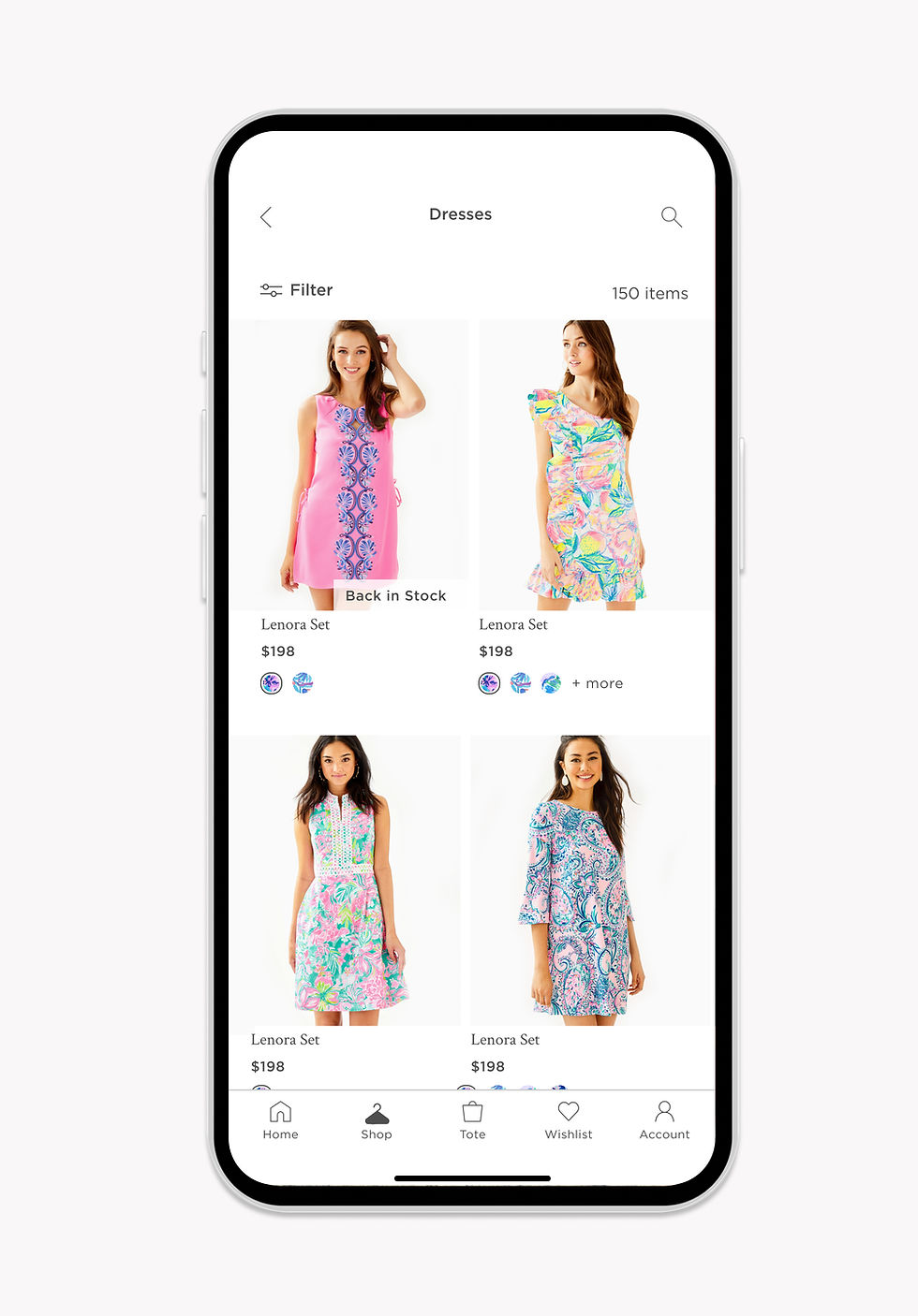
Horizontal Navigation for Faster Product Discovery
I updated the Shop icon from a dress to a hanger to better represent a broader apparel offering. Since the brand planned to expand into men’s categories, the hanger provides a more universal symbol for shopping
I also redesigned the Shop page to introduce a horizontal navigation bar that surfaces all categories upfront. Previously, users had to tap a category image, view subcategories, and then navigate to the PLP. The new structure allows users to see categories at once and jump directly to product listings, reducing the flow from three clicks to one and improving browsing efficiency.
Before

After
.jpg)
Flexible Product Grid for Faster Purchase
To help increase checkout conversions, I introduced flexible grid options on the PLP. Users can switch between a two-column view for quick browsing or a single-column layout that shows more product details.
The two-column grid allows users to swipe through product images directly within the card, while the single-column layout enables an “Add to Tote” action without opening the product page, helping users make quicker purchase decisions.
Before
.jpg)
After
Problem
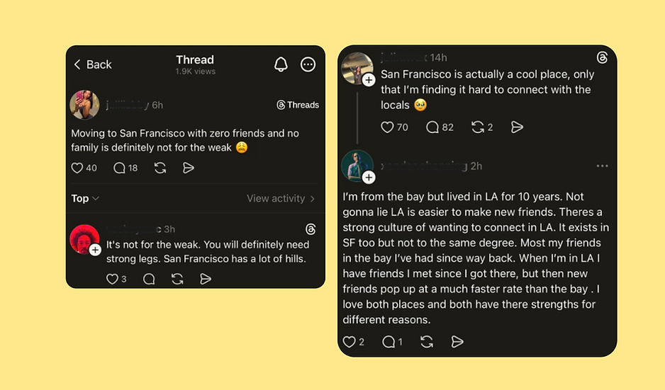
People aren’t struggling to find events in a new city.
They’re struggling to feel comfortable enough to connect.
-
Moving to a new city often leads to social isolation and disconnection
-
Existing platforms can feel overwhelming and socially intimidating
-
Large group settings create pressure and hesitation for newcomers
-
Many people want connection, but don’t feel emotionally ready to participate
Opportunity
Designing social experiences around emotional comfort
How might we help newcomers feel less isolated and more emotionally comfortable while
building connections in a new city?
Bello AI
AI-powered social discovery app for newcomers in a new city
Bello helps newcomers feel more comfortable building connections through conversational onboarding, curated weekly experiences, and AI-guided group interactions designed to reduce social pressure and loneliness.
Role
Research
Product Strategy
Design System
Product Design
Team
2 Designers
1 Mentor
(Design Lead at Gemini)
Timeline
Jan 2025 - May 2026
Tools
Claude
Nano Banana
Figma Make
Figma
Presenting Bello

Let's Build
Together
© 2026 Shimona Roy