Reflection
Designing the Lily Pulitzer iOS app highlighted the importance of translating an existing web experience into a mobile-first product while staying consistent with the brand’s design system. The process required adapting layouts, navigation patterns, and interactions so the experience felt natural on smaller screens.
Working closely with engineers also introduced the nuances of building interfaces with SwiftUI, ensuring the UI followed Apple’s Human Interface Guidelines while maintaining Lily Pulitzer’s visual identity.
This collaboration helped bridge design decisions with technical implementation and ensured the mobile experience aligned with native iOS interaction patterns.
Research
Decoding customer insights from user research

The Nurturing Devotee
(25–35 yrs)
“I love the brand and shop often, but browsing on my phone takes too many steps. I wish it felt faster to explore collections.”

The Value Hunter
(Mid 20s)
"Sometimes I just want to quickly check what’s on sale that fits my budget. But those offers usually get buried in my emails, and when I try to check on my phone it takes too long to find them.”

The Selective Wearer
(30+ yrs)
“I like the brand, but unless something really catches my eye, it’s hard to discover what suits me.”

The Occasional Buyer
(25+ yrs)
“Sometimes I need something quickly for an event. I wish I could just check which nearby store has it and pick it up instead of waiting for shipping.”
The Deloitte research team conducted qualitative research to understand how Lily Pulitzer customers interacted with the existing web experience.
The insights were shared with the design team as a detailed research document outlining different customer segments and their motivations. We used these findings to decode where the mobile experience was creating friction and what opportunities a native app could unlock.
A clear opportunity to reduce friction through a native iOS experience

• Provide faster access to new arrivals, promotions, and sale items
• Enable real-time notifications for sales and product updates

• Simplify product discovery and browsing on mobile
• Introduce advanced search that surfaces relevant results as users type
• Personalize the shopping experience for returning customers

• Integrate store locator with maps and nearest-store navigation
• Support in-store pickup for faster access to products
UX Strategy

To replicate the core shopping journey within the app, I mapped a simplified user flow that captured the key paths customers would take from discovering products to completing a purchase.
Modular Page Strategy
Designing flexible page structures for editorial and product content
Unlike a traditional e-commerce interface, Lily Pulitzer’s experience blends product discovery with editorial storytelling. To support this, we developed a modular layout system that allowed each page to be assembled using reusable content blocks.
By defining these modules early, the current and future design team could quickly structure pages and later populate them with visual components from the design system.
.png)
Design System
Translating the Web Design System for iOS

Solution / Core Flows
Turning insights into a seamless mobile
shopping journey
Discovery
Homepage
Highlights seasonal campaigns, new arrivals, and curated product stories. Its modular structure allows content to be updated dynamically, enabling the brand to surface trending products, prints, and collections throughout the year.
Search
Advanced Search
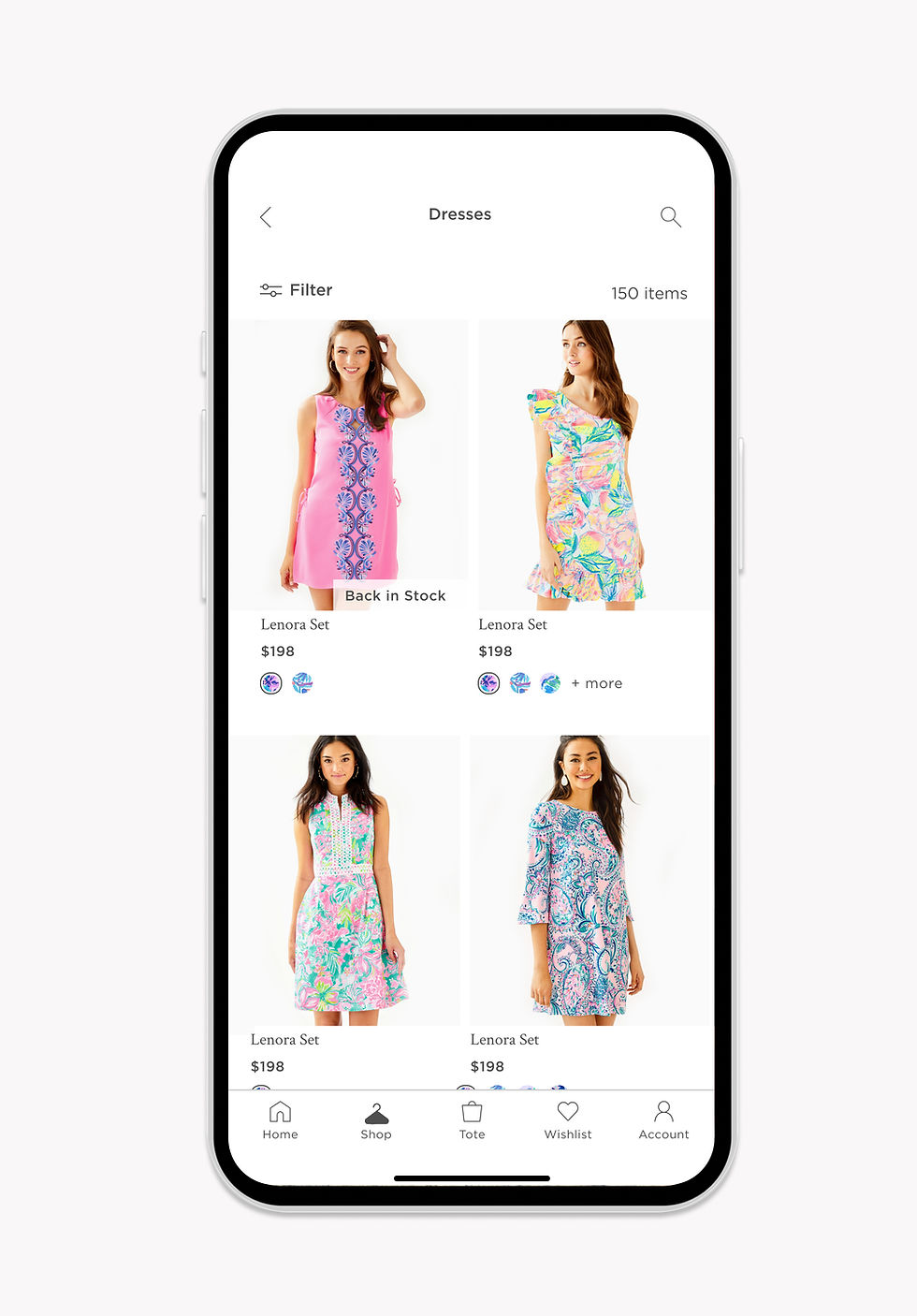
The Shop page organizes products into categories, allowing customers to explore the breadth of collections. From here, users move into the Product Listing Page where they can browse items, apply filters, and refine their search.
Browse
Product Listing Page + Filters
The Product Detail Page helps customers evaluate a product through detailed imagery, sizing information, pricing, and reviews before adding items to their cart.
Fulfillment
Product Detail Page + In-Store Pickup or Checkout
Customers can complete their purchase through a streamlined checkout flow or choose in-store pickup to get the product faster from a nearby location.
Usability Testing Decisons
Post-Launch Usability Improvements
Three months after launch, we analyzed user behavior and feedback to identify opportunities to streamline browsing and improve product discovery.
Horizontal Navigation for Faster Product Discovery
I updated the Shop icon from a dress to a hanger to better represent a broader apparel offering. Since the brand planned to expand into men’s categories, the hanger provides a more universal symbol for shopping
I also redesigned the Shop page to introduce a horizontal navigation bar that surfaces all categories upfront. Previously, users had to tap a category image, view subcategories, and then navigate to the PLP. The new structure allows users to see categories at once and jump directly to product listings, reducing the flow from three clicks to one and improving browsing efficiency.
Before

After
.jpg)
Flexible Product Grid for Faster Purchase
To help increase checkout conversions, I introduced flexible grid options on the PLP. Users can switch between a two-column view for quick browsing or a single-column layout that shows more product details.
The two-column grid allows users to swipe through product images directly within the card, while the single-column layout enables an “Add to Tote” action without opening the product page, helping users make quicker purchase decisions.
Before
.jpg)
After
Problem
A web-only mobile experience was limiting traction and customer loyalty
For years, Lily Pulitzer relied on its e-commerce website as the primary digital shopping channel.
As customers shifted to mobile, the web experience struggled to deliver fast navigation, personalization
and seamless product discovery, leading to lower engagement.
Lilly Pulitzer
Designing a native iOS shopping experience for a leading American fashion brand
Lilly Pulitzer partnered with Deloitte to design its first native iOS shopping app, creating a mobile-first experience with faster browsing and deeper personalization beyond the traditional web store.
Role
Product & UX Design
Design System
Native UI Design
Team
Creative Head
6 Engineers
3 Designers
Timeline
July 2020 - June 2021
Tools
Sketch
Product Overview

Let's Build
Together
© 2026 Shimona Roy