San Francisco, CA

PROJECT OVERVIEW
Lilly Ville is an American fashion brand that started 60 years ago by a fashion entrepreneur who designed & distributed apparels for women & children. Today, they have a collection of modern resort wear inspired by Palm Beach lifestyle available across various digital platforms and 60+ retail stores and website for online shopping.
COMPANY
Lilly Pulitzer, US Worldwide
My Role: User Research, User Flow, Design Library, Hi-Fi Mockups & Product Development
CHALLENGE
Create a personalized shopping experience by transitioning from web to the app world and gain customer loyalty with increase in conversion rate.
Problem Area
-
Retaining to only web experience >minimizing recall value and customer loyalty
-
Slow shopping
-
Not delivering expected revenue growth
-
Inability to add native features
Design Process

Research & Analyse

UX Development

Concept / UI Design

User Testing
PROJECT OVERVIEW
The Helen Keller Institute for Deaf & Deafblind is a premier institute for the education, training and rehabilitation of the Deaf and those who have Multiple Disabilities with Vision Impairment recognized by the State/Central government and many international organizations.
MY ROLE
Product Designer
User Research, Redefine IA, Visual Design,
Accessible components & Hi-Fi Mockups
CHALLENGE
Redesign website with a well built content management system to grow more awareness about the NGO whilst increasing the rate of funding and employment for specially abled.
User Research
(Qualitative Insights / User Story)

The Value Hunter
(Mid 20's)
The Value Hunter gets an adrenaline rush when searching for high-value deals. She likes Lilly, but that love is conditional.
Pain point: Lacks confidence with the brand
The Rising Embrace
(Early 20's)
The Rising Embracer is at the start
of her career, family, or similar important milestone. She celebrates these moments with Lilly but might not be consistent.
Pain point: Not that loyal

The Selective Wearer
(30+yrs)
She likes the brand but doesn’t
want to be recognized as wearing
Lilly regularly.
Pain point: Does not feel
empowered
The Nurturing Devotee
(25 -35 yrs)
The Nurturing Devotee has a wide variety of Lilly in her wardrobe and Lilly is a go-to purchase for her family, friends or loved ones.
Positive: Trust the brand
The Rewerant Steward
(20 -30 yrs)
The Reverent Steward truly worships not only the Lilly Pulitzer brand, but moreover the woman herself. She feels personally connected to Lilly.
Positive: Feels Empowered
Secondary Research
Why digital shift to iOS App?
Ease of Access
Reduced Friction
-
One stop solution for all
-
No Additional Effort
-
Ease of sync of contacts, QR codes, Gps Etc
Increased Personalization
Better Content Delivery
-
Advanced Search
-
Product Notifications
-
Save favourites to Wishlist
-
Rating and Reviews
-
In-Store Pick Up
-
Push Notification
-
Less time consuming
-
Updates as per need
Goal Statement
We want the users to:
Feel Empowered
-
By understanding the value of the products.
-
Understanding the story behind
-
the craftsmanship.
We want the users to:
Trust the Brand
-
Be able to find product types & fits as per their needs through easy browse
-
Engage with a consistent and personal experience
User Flow
I created a simple path to be taken by the user on the app, so they can
complete a task from start to finish.
.jpg)
UX Principles
4 key ingredients to storytelling

Homepage
Customers are driven to
a story page or PLP page from the navigation or a CTA on the homepage.
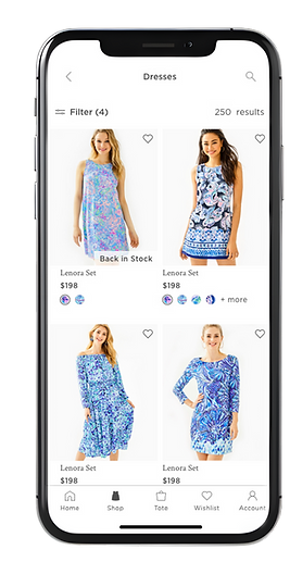
Category Landing Page
A [CLP] is used to show the breadth of product around
a category like “Dresses” & allow customers to explore.
PLP
The product landing page [PLP] has a pure focus on product and allows users to narrow their interest.
PDP & Checkout
The product Description page [PDP] has details of the product along with checkout flow.
Set up the story
Choose the category. Select component modules and populate the pages.

UI Design Process

Study brand guideline
Check accessibility of colors and font (ADA Comlient)
Create library for components, symbols, patterns
Design hi-fidelity screens
Design sign off from
clients
Work on feedback
Final client demos
Typography
& Colors

Components
.jpg)


8 Point Grid
Atomic Design Strategy:
A system using increments of 8 to define elements on a page using dimensions, padding, and margins for both block and inline elements.

High Fidelity Mockup Ups
A few clicks
On the homepage screen there are direct links that are filter based to help customers with their requirement. It will be followed by a CTA to shop for new arrivals keeping in the awareness for latest trends. The screen will also include suggested items of clothing and prints that may help customers to ease their selection process.
Wishlist would help them bookmark their favourites or buy in store.

Anything you want
The product landing page [PLP] has a pure focus on product and allows users to narrow their interest. The Filter option helps customers shortlist from a ranges of categories like Occasion, style, color, price etc.
Storytelling
Customers are driven to a category landing page [CLP] or story page from the navigation or a CTA on the homepage.A story page can be used to tell stories around a product category.

The details
The screen showcases all the relevant information (product description) customers may want to know before making a purchase. The details displayed will include size, color, price, reviews with CTA of ‘pick up in store’ and ‘add to cart’.

Product Development
Filters
Challenge
-
Exhaustive list of filters seemed overwhelming and non-intuitive
-
Ever changing sets of filters as per the product needed a dynamic component
Solution
-
To make the filter feature easily usable, I designed it to be more visual. To highlight the elements such as the colour & print we needed to support the names with the visual for the customer to make quick decisions with confidence

In Store Pick Up
Challenge
-
Some customers prefer the option to pick up their purchases in store, especially if they need the item quickly or want to save on shipping costs.
-
Without the option for customers to pick up in store, you may incur higher shipping costs if the store is near you.
Solution
-
Minimized delivery time by adding in-store pickup feature.
-
Adding native feature to call and locate the store
-
Adding additional feature to save your preferred stored help customers to save navigation time for their next journey.

Checkout
Challenge
-
Reduce the drop rate during checkout journey to increase conversion rate
Solution
-
Add express payment options which are PayPal & Apple Pay
-
Persistent order summary feature to reassure the customer while purchasing high value items.
-
Installment options offer flexibility in payment schedules, allowing customers to choose a plan that fits their budget and financial situation.

Project Learnings
1. Understand the Limitations of iOS Platform
The research helped me to understand that the success of product lies with great design, engineering and strategy combined. It was important to learn the limitation of iOS native features and guideline from the Dev team to build iOS friendly navigation.
2. User Testing is vital
Testing solutions in whatever form (paper, low-fi or hi-fi) with engineers or stakeholders as early as possible saves ample amount of time and re-work.
Key Metrics
The app successfully launched in 2021 and is available on iOS app store.
The company experienced 8,000 downloads of its app in the first 90 days
after implementing such a seamless experience.