San Francisco, CA

PROJECT OVERVIEW
The Helen Keller Institute for Deaf & Deafblind is a premier institute for the education, training and rehabilitation of the Deaf and those who have Multiple Disabilities with Vision Impairment recognized by the State/Central government and many international organizations.
CLIENT
Helen Keller NGO, Mumbai, India
My Role: Qualitative Research, Persona Study,
Redefine IA, Accessible Visual Design & High Fidelity Mockups
CHALLENGE
Redesign website with a well built content management system to grow more awareness about the NGO whilst increasing the rate of funding and employment for specially abled.
Problem Area
After gaining insights about the NGO'S vision and understanding the expectations set for such crucial platform,
I turned my attention to evaluate problems with their old website. The identified issues are as follows:
-
No clear route that the user is pushed to take
-
Too much information being presented at once /text heavy
-
No visual hierarchy
-
Antiquated look and feel / not professional
Heuristic Markup

Too much information.
No focal point
Extra headers. No hierarchy
Busy background.
Text overlap

Unnecessary placeholder image
No synergy with icons
Qualitative Research
Based on Interviews conducted by our team and few moderate tests conducted by me, below are the experiences I gathered from our different set of users.
Each persona highlights its specific user story.

Contributors
Individuals - They want to contribute to the cause of the Institute through donations, volunteering or buying products.
Corporation - They want to contribute through:
-
Donations and sponsors
-
Organising Events/Exhibitions
-
Provide employment opportunities for people with disabilities

Learners
Prospective Teachers - They want to empower children with disabilities through some platform.
Individuals with Disability -They want to learn new skills and find suitable employment opportunities considering their MDVI disabilities.

Parents & Relatives
-
Learn more about Helen Keller's offerings and understand the admission process.
-
Learn about their role and responsibilities in helping their children.
Secondary Research
8%
Population suffer from Deuteranomaly.
It is a common type of red-green color vision deficiency which makes certain shades of green look more red.
1 in 33,000
People suffer with monochromatic vision where they can see no colour at all and their world consists of different shades of grey ranging from black to white.
Insights from the NGO Experts
Below are the high contrast colors that passed 'AAA' criteria accessibility test for maximum color blind people.
#2A0898
#EEC147
#1C1C1C
#646464
Affinity Maps
I build affinity maps to synthesize research insights, uncover patterns, and drive user-centered design decisions.


Information Architecture
Primary navigation
Existing items on old site
Proposed items
Home
About Us
Get In Touch
Services
Get Involved
Latest Stories
Who we are
Stories Gallery
Volunteer
Donate
In the News
Contact Us
Press Reports
-
Introduction
-
Vision
-
Mission
-
Institutes
-
Teams
-
Awards
-
Annual Reports
Experience MDVI
Direct
-
Early Intervention
-
Educational Services
-
Vocational Training
For Children
Corporate
Support
For Parents
Workshops
-
Directory
-
School Calender
Product
Catalouge
For Learners
FAQs/ Queries
Social Media
Links
-
Diploma in special education
Download Forms
How did I make an accessible Design System for
MDVI (Multiple Disability with Visual Impairment)?

-
Use of High Contrasting Colors
-
Ability to change text size

-
Enable Audio
-
Enable Screen Readers

-
Include Captions
-
Keyboard Accessibility
UI Specs

Old vs New Website

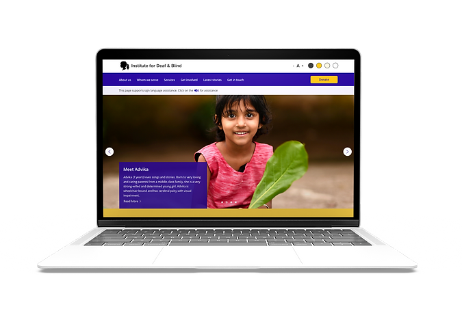
Variable Text Sizes
Bigger icons for
more tappable area
Crisp headers with are primary for navigation, audio assistance
Clear Image with no disturbance
Donate button on the right for primary action
User Interface &
Features
Assistive Design
-
Use of High Contrasting Colors
-
Ability to change text size
-
Audio Assistance
-
Keyboard Assistive
Simplified Interface
-
Structured layout
-
Simple Navigation
-
Shortcuts for courses, donations, volunteers
-
Easy Jargons

Hi Fidelity Mockup


Generate Awareness
Short snippets about the people working at the institute, children and families of the children.
Dedicate intentional real-estate on the website, to highlight and elaborate on these stories.
Non-Commerce Platform
Create an online catalogue for their webpage displaying their products.
Connect with their social platforms to gain more insight and engagement.
Education
Array of services provided for the specially abled along with the courses that they can pursue and graduate in.
This will help the students get jobs as per their proficeincy.
Usability Testing Insights
After I conducted unmoderated user testing on a small scale depending on the timeline and scope of project,
below are the takeaways from the user insights that will be incorporated in future.
-
Enable Regional Language Translation
-
Increase icon sizes that are more relevant for deaf-blind
-
Transition to commerce website / Ability to sell products online
-
Ease of navigation for different donation checkout
Project Learnings
1. Simplicity is strength
As a designer, we are often lured by attractive, trendy and out of the box designs. But, we must always
remember the ‘why’. The primary goal is to understand the user, their problems and then come up with a
design that solves it.
2. Equitable Design is Important
This project targeted maximum users who are parents, teachers and general audience that need to gain awareness
about the NGO. But we should not forget audience that have experiences indifferent from you.
Users of all abilities, identities and experiences need to be able to successfully move through your products design.